If you’re looking for a simple way to build a professional-looking website without coding, Hostinger Website Builder is a great option. Unlike WordPress or Wix, which require some knowledge of layouts, grids, or plugins, Hostinger’s drag-and-drop builder allows you to design freely on a blank canvas. You don’t need to follow any strict grid or flexbox structure, just place elements anywhere you like. In this tutorial, I’ll guide you through the process of creating a website from scratch using Hostinger Website Builder.
Step 1: Get Hosting from Hostinger
To use Hostinger Website Builder, you’ll need a Hostinger hosting plan. Visit this page to access Hostinger’s website with an extra 20% discount. Click Claim Deal to see the available plans:
- Premium Plan – $2.99/month (host up to 25 websites, SSD storage)
- Business Plan – $3.79/month (host up to 50 websites, NVMe storage)
- Cloud Startup – $7.99/month (host up to 100 websites, NVMe storage)
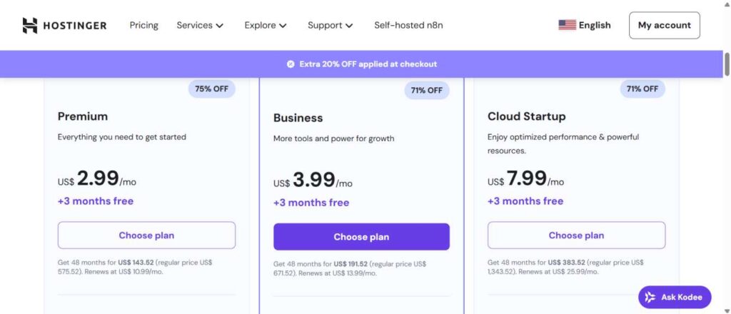
After comparing, select the plan that best suits your needs. By default, Hostinger applies a 48-month plan with the discount already added (around $37 off). You can also adjust the duration if you prefer a shorter plan. Once selected, create your account, complete the payment, and you’ll be taken to the Hostinger dashboard.
Step 2: Start with Hostinger Website Builder
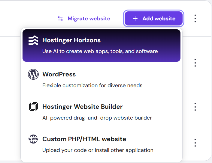
From your Hostinger dashboard, go to Websites.
- Click Add Website → select Hostinger Website Builder.
- You’ll be prompted to choose a template. Since we’re starting from scratch:
- Scroll down and select Blank Template → Start from Scratch.
- The editor will now open with a clean canvas.
Step 3: Understanding the Editor
You’ll see a blank canvas with a hidden header section (it won’t affect your design unless you make it visible). To test, try adding a pre-made section. In preview mode, you’ll notice the header doesn’t appear. You can now freely drag and drop elements, resize text, change typography, and customize layouts. For this tutorial, we’ll delete the default section and begin with an empty canvas to replicate the target website design.
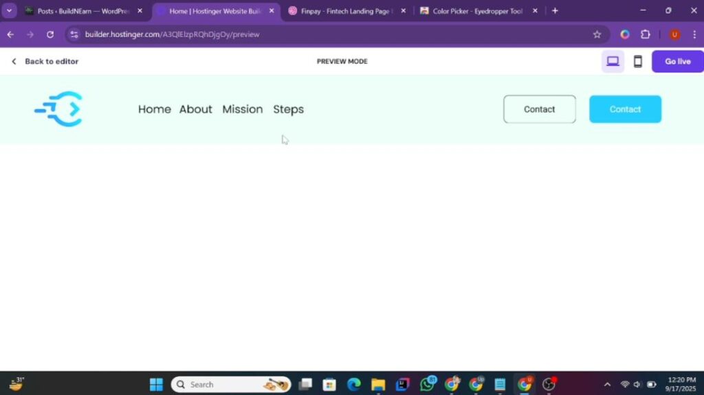
Step 4: Designing the Header Section
A website header typically includes a logo, navigation menu, and call-to-action buttons. Let’s build this step by step in Hostinger Website Builder.
Add a Blank Section
- Click Add Section → Blank Section.
- Open Edit Section → Background → Color.
- Use the color picker to set your background. (For this example, we’ll choose a greenish shade.)
Add and Customize the Logo
- From the Elements tab, drag an Image element into the top-left corner.
- Resize it to fit neatly into the header.
- Click Edit Image → Replace Image → upload your logo.
- Adjust its size and position to align properly.
Create the Navigation Menu
Since Hostinger Website Builder doesn’t have a built-in navigation menu for landing pages (which we can linked with on-page sections), we’ll create one using text elements:
- From Elements, drag a Text element next to the logo.
- Change its style to Heading 6 and type your first menu item (e.g., Home).
- Adjust typography
- Duplicate the text element for other menu items (e.g., About, Mission, Steps).
- Align them evenly next to each other.
- Link them internally by choosing the Section instead of Page, it will be possible once you add anchor tags.
Add Call-to-Action Buttons
Now let’s add two buttons. First Button – “Contact Us”
- Drag a Button element to the right side of the header.
- Edit the text → Contact Us.
- Go to Style:
- Background: Transparent
- Text Color: Black
- Font: Poppins (or whichever you like)
- Border: Black, 1px
- Corner Radius: 8px
- Add hover effect:
- Background: Blue (matching the logo color)
- Text Color: White
Now do the same to create the second button with with your own choice colors and typography or follow the video at the end of this blog post.
Final Adjustments For Header
- Move the logo to the left and the buttons to the right for proper spacing.
- Align the menu items closer to the logo for a balanced look.
- Save your changes and preview the design.
- Make sure to make your design responsive for mobile devices as well. You will get a better idea by following the video guide at the end of this blog post.
Now you have a fully functional header section that looks modern and professional, closely resembling the sample website. Be careful: If you delete an element in mobile view, it will also be deleted in the desktop version. Only resize or reposition elements—never delete them.
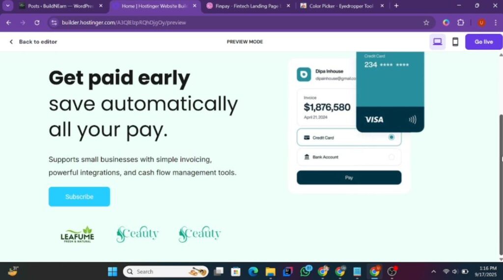
Step 5: Creating the Hero Section
Now let’s move on to the hero section of the landing page. This section typically contains a heading, a short paragraph, an image, and a call-to-action.
Add a Blank Section
- Click Add Section → Blank Section.
- Set the background color to match the header for consistency.
Add the Hero Heading
- Drag a Text element into the new section.
- Change its text
- Change typography and size
A New Paragraph
- Drag another Text element and paste the paragraph.
- Change typography
- Change font
- Make changes in style and size
Adjust width according to your requirements.
Add the Hero Image
- Drag an Image element into the section.
- Replace it with your chosen image (e.g., product, mockup, or brand graphic).
- Resize and position it below the heading and paragraph, ensuring it matches the sample site’s layout.
Add a Call-to-Action
Now, we needs to add a button in the hero section of our Hostinger website.
- Duplicate one of the header buttons.
- Drag it under the paragraph in the hero section.
- Customize the text (e.g., Get Started, Subscribe Now, Join Us).
- Adjust its style if needed (color, border, typography).
Adding Client Logos Under the Hero Section
Now that we’ve placed the button in our hero section, the next step is to showcase client logos. This adds credibility and trust to your landing page.
- Upload the Logos
- Go to Elements → Image.
- Drag an Image element next to the button.
- Resize it to fit properly.
- Click Edit Image → Replace Image → Upload File.
- Upload your client logos (e.g., Lithium, Work Nest, etc.).
Duplicate and Replace
- Duplicate the first logo and place it beside the original.
- Replace it with your second logo.
- Repeat the process for the third logo.
Adjust Placement
- Drag and align all three logos under the button.
- Make sure they are evenly spaced and centered.
- Reduce the height of the section to keep it clean and compact.
- Make sure to make your hero section mobile responsive.
Now your hero section has a headline, paragraph, image, CTA button, and client logos—all neatly organized.
Step 6: Building the “Why Prefer Us” Section
Next, we’ll create the “Why Prefer Us” section. In the sample website, this area includes a heading and multiple highlight boxes with stats and supporting text.
Add a New Section
- Insert a Blank Section.
- Change the background color to the greenish shade (matching the hero section for contrast).
Insert a Subheading
- Duplicate the previous subheading.
- Place it in the center of this new section.
- Replace text with Why Us (or Why Prefer Us).
- Change font according to your choice.
Add the Main Heading
- Insert a new Text element.
- Add the text.
- Change font and size
- Center-align it and drag it slightly lower for balance.
Add the First Highlight Box
- Drag a Shape element (rectangle/square).
- Place it on the left side of the section.
- Adjust dimensions: wider than tall.
- Change its color to white.
Inside the box:
- Add a large number (e.g., 25+).
- Select font style
- Set its size between 90–110px
- Select a color
- Below it, add supporting text (e.g., Websites Hosting Capacity).
- Select a font for other text
- Choose a font size of that text.
This creates a bold, eye-catching stat card similar to the sample site.
With that, you now have the first card in your “Why Prefer Us” section. You can duplicate this design for the remaining cards by replacing text and adjusting spacing.
Step 7: Adding the Guarantee and Feature Sections
After finishing the previous section, the next step is to build the “30 Days Money Back Guarantee” section and the feature highlight containers that include headings, paragraphs, and images.
Creating the Money-Back Guarantee Section
- Duplicate a Container
- Take an existing container from your layout.
- Duplicate it and place it next to the previous one.
- Drag slightly to the left to align with the heading.
- Add Heading Text
- Duplicate a text element from your site.
- Change the text to: “30 Days Money Back Guarantee”.
- Center it properly and adjust the width for balance.
- Upload the Guarantee Image
- Take a screenshot of the guarantee image from your sample site.
- Remove the background (Canva Pro or any free tool).
- Upload it using Image → Edit Image → Replace Image.
Resize it by reducing the height first, then increasing the overall width. At this point, you have a neatly aligned guarantee block with heading and image.
Building the Feature Highlight Section
Now we’ll add another container that combines image + heading + paragraph.
- Add a Shape Background
- Insert a square shape element.
- Stretch it by dragging the sides (increase width and height).
- Change its color to white.
- Add Heading Text
- Paste/write your text into a text element.
- Style it to make it more attractive.
- Choose a font style.
- Adjust its size to somewhere between 27–30px
- Align it to the top-right corner of the shape.
- Add Paragraph Text
- Write your paragraph into a text element.
- Style the paragraph.
- Adjust the width to match the sample design and align it below the heading.
- Upload the Feature Image
- Insert an image element and replace it with your image.
- Resize by increasing width from both sides until balanced.
Now your feature container has a white box, a bold heading, a paragraph, and an image—aligned just like the reference site.
Making It Responsive for Mobile
Since these elements can look messy on smaller screens, let’s fix responsiveness:
- Open Mobile Editor.
- Reorder elements: Place heading → paragraph → image in vertical flow.
- Resize text according to mobile screen.
- Adjust container size: Increase height/width of shapes where necessary, then realign content to center.
- Resize images: Reduce height, expand width to fit mobile layout.
- Repeat the same process for the second and third feature containers.
- Save your changes.
Open Preview Mode on desktop and mobile. Ensure all containers (guarantee + features) are aligned and responsive. If you notice extra spacing (like gaps between menu items, logos, or buttons), drag the elements closer to tighten the layout. Your Guarantee and Feature Sections are now complete and responsive.
Step 8: Creating the Steps Containers
In the sample website, the next part is a “Steps” section that outlines the process in three numbered containers. Let’s replicate that design inside Hostinger Website Builder.
Add a New Section
- Scroll down and insert a blank section.
- Keep the background color as default (white), since the previous section already used the greenish background.
- Add Subheading and Heading
- Duplicate an existing text element and drag it into the new section.
- Change the text to: Steps.
- Set the text alignment to left side.
- Insert a new text element under the subheading.
- Adjsut it’s size and font style.
Now you have a clean subheading and heading ready for the steps layout.
Create the First Step Container
- Add a Shape Background
- Insert a shape element and place it under the heading.
- Stretch its height and width to form a neat rectangular box.
- Change its background color to the greenish shade (to contrast with the white section).
- Add the Step Number
- Insert a text element and type: 1.
- Increase the font size to around 90px.
- Change its font style.
- Adjust color to match your theme.
- Add Heading Text
- Insert it below the number.
- Style its typography.
- Add Paragraph Text.
- Insert another text element under the heading.
- Style it with Inter Regular and reduce width for readability.
- Replace placeholder text.
The first step container is complete.
Duplicate for Step 2 and Step 3
Duplicate the entire shape container (with number, heading, and paragraph). Place it in the center for Step 2, and then again for Step 3. Update the numbers (2, 3) and replace the headings/paragraphs with the correct text. Now you have three step containers aligned on desktop view.
Make the Section Responsive for Mobile
On mobile view, the layout may look messy. Let’s fix that:
- Rearrange Containers
- Place each container stacked vertically under the heading.
- Increase the height of each container slightly to give breathing space.
- Adjust Text Sizes
- Subheadings: reduce from 32px → 26px.
- Step numbers: keep large but centered.
- Headings: reduce from 32px → 26px.
- Paragraphs: keep at 16–17px.
- Center Alignment
- Make sure all text (numbers, headings, paragraphs) are centered within each container.
- Adjust widths so paragraphs don’t stretch too wide.
Step 9: Adding the “Our Mission” Section
The next section is titled “Our Mission.”
- Add a new blank section.
- Change the background color to distinguish it from the steps section.
- Copy the subheading text (“Steps”) and replace it with “Our Mission”.
- Align it to the center of the section.
Now you’ve prepared the base for the “Our Mission” section, ready to add more content next.
Adding the “Our Mission” Section
- Insert a Heading
- Place it below your subheading.
- Center-align and reduce its width.
- Insert a Paragraph
- Place it below the heading.
- Center-align, slightly reduce width, and adjust spacing so it doesn’t break into three lines.
Now your “Our Mission” section is complete with heading + paragraph.
Adding Stats
- Add the First Stat (24%)
- Duplicate a heading, change text to 24%, and increase font size to 48px.
- Place it on the left and center-align it within its text box.
- Add a subheading below it (e.g., Revenue Business).
- Add the Second Stat (180K)
- Duplicate the first stat block.
- Change the number to 180K.
- Add a subheading (e.g., In Annual Revenue).
- Add the Third Stat (10K+)
- Duplicate again, place it on the right.
- Update the text to 10K+.
- Add a subheading (sample site text).
Now you have three clean stats columns.
Step 10: Adding the Pricing Plans
- Insert Section & Heading
- Add a blank section with white background.
- Add heading: Choose Plan, centered at the top.
- Create Plan Container
- Insert a shape element, change background to green.
- Give it a tiltle.
- Set its price.
- Button: Copy from hero section, update text to Buy Now.
- Duplicate the entire container.
- Change the plan name and second container is ready.
Now your pricing section with two plans is ready.
Step 11: Adding the Call-to-Action
- Add a blank section with green background.
- Add heading and paragraph.
- Then add Buttons
- Duplicate existing buttons from header.
- First button: Get Started.
- Second button: Contact.
- Place side by side and center them.
Now you have a CTA section to push conversions.
Step 12: Adding the Footer
- Insert your logo image into the footer section.
- Add Menus
- Insert subheading: Solutions.
- Add menu links under it (Home, About, Services, etc.).
- Duplicate this group for other menu elements (if you have more).
- Add Social Links
- Insert subheading: Follow Us.
- Add social media icons (customize layout, links, and color).
Your footer now includes logo, menus, and social links.
Step 13: Publishing the Website
- Click Go Live.
- Your site will now be accessible via its Hostinger URL.
- If you own a domain, connect it in the Domain Settings.
Remember: Updates only appear when you click Publish again. Your Hostinger website builder’s website is now live and ready to share!